
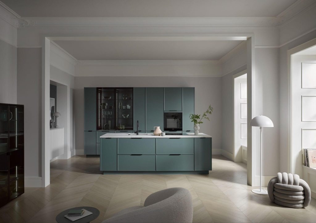
Emerald Green Kitchen Design Ideas: Australia’s Bold 2026 Trend
8 emerald green kitchen design ideas, from matte handleless islands to high contrast black pairings. See real designs at Häcker Australia showrooms.
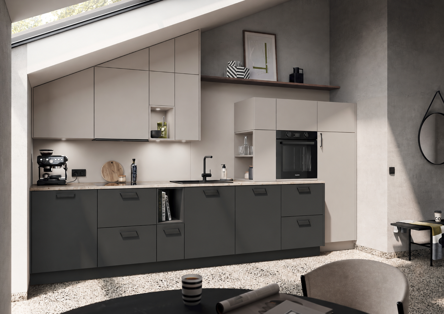
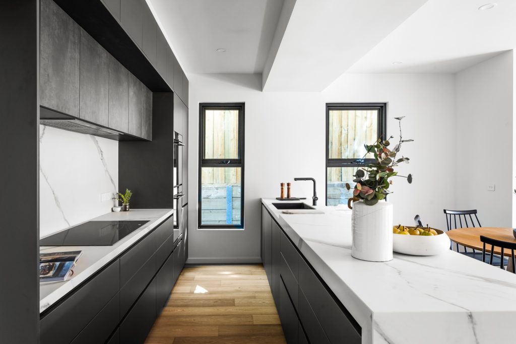
Charcoal has moved from bold accent colour to one of the most requested finishes in kitchen renovations. It’s dark enough to feel dramatic, but far more versatile than true black, it softens under natural light, warms up next to timber, and sharpens up next to white stone. Here are ten ways to bring charcoal into your own kitchen design.
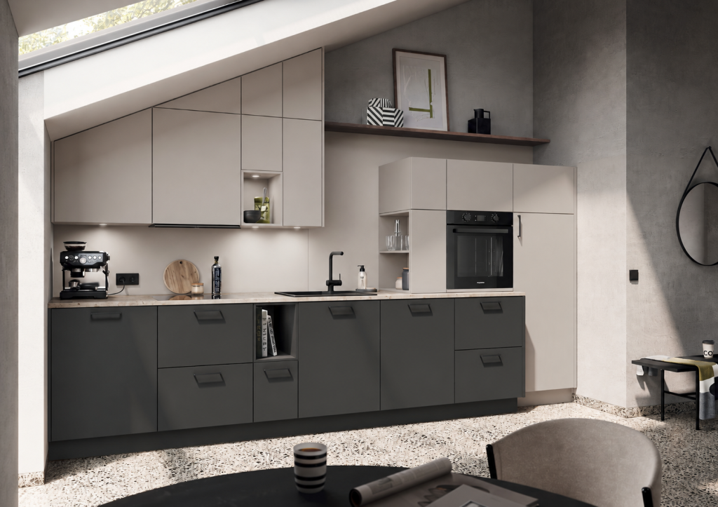
The most popular configuration in charcoal and white kitchen designs. It grounds the room without darkening the sightline at eye level and above, and tends to suit smaller kitchens better than an all charcoal scheme, since the white upper cabinetry keeps the ceiling line feeling open.
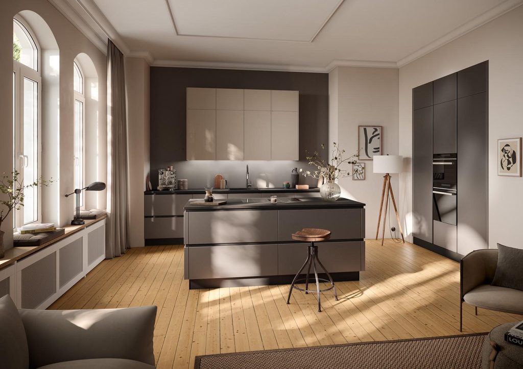
Less common than lowers and uppers, but effective in larger or open plan kitchens where you want a charcoal feature, typically an island, without committing the whole room to dark tones. A charcoal island with a contrasting white or light stone benchtop is one of the most consistently recommended “statement without commitment” moves across current kitchen design content.
The warm, livable alternative to charcoal and white. The timber grain and warm undertone counteract charcoal’s coolness. Common applications include timber floating shelves against a charcoal splashback or feature wall, timber veneer cabinet fronts mixed with matte charcoal joinery, and timber benchtops on an island with charcoal on the surrounding perimeter cabinetry.
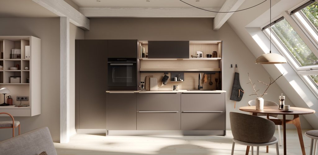
Timber tone matters here: a pale timber (blackbutt, oak, birch) creates the highest contrast and reads more Scandinavian or minimalist, while a warmer, richer timber (walnut, spotted gum) creates a moodier, more traditional or modern rustic result. Pick one timber tone and stay consistent across shelving, flooring and benchtop, mixing more than one is one of the more common ways this pairing goes wrong.
Charcoal grey sits between true charcoal and mid grey, lighter and cooler than a deep charcoal, but still firmly in dark neutral territory. It’s a useful middle option if full charcoal feels too heavy for your space but you still want a dark, contemporary cabinetry colour.
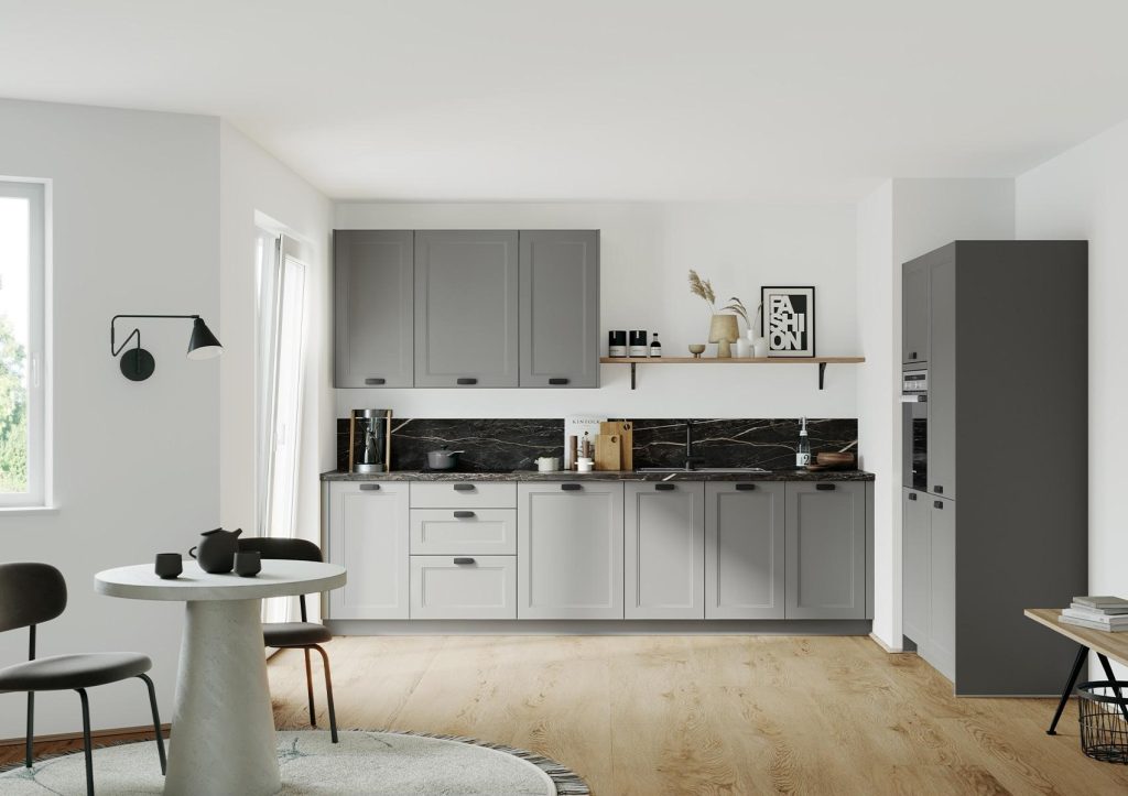
It’s also more sensitive to lighting conditions than deeper charcoal shades, so use warm white (not cool white) LED strip lighting under cabinets and inside open shelving to stop the grey reading flat or clinical, and test the actual cabinet sample under your kitchen’s real lighting at night, not just in daylight or in a showroom.
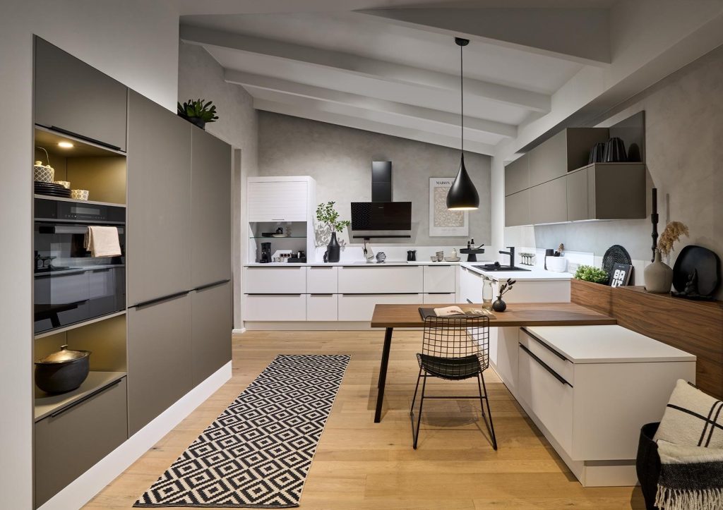
Large or open plan kitchens can carry more charcoal without feeling closed in, including full height charcoal cabinetry runs, since the surrounding open space does the lightening work. This is the look to reach for if you want maximum drama and have the floor plan to support it.
Benchtops and splashbacks in white stone (quartz or marble look engineered stone) are the standard contrast point for charcoal cabinetry. In a small kitchen, keep the white surfaces large and continuous, a broken up white in a small tiled splashback pattern can actually make a charcoal kitchen feel busier rather than lighter. A charcoal benchtop generally needs lighter cabinetry (white or light timber) to avoid the whole kitchen reading as one dark block, so if you already have charcoal cabinetry, it’s usually better to contrast with a white or light stone benchtop rather than doubling down on charcoal on charcoal.
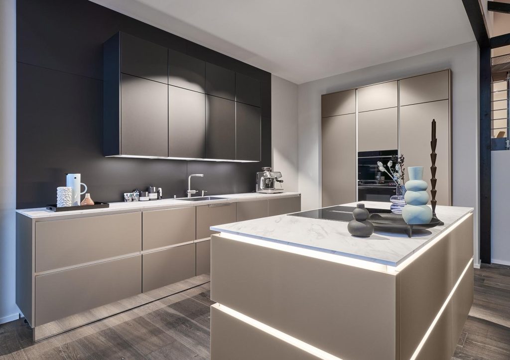
Charcoal isn’t only a cabinetry colour, it’s also one of the fastest growing categories in benchtops. Current Australian benchtop trend data shows charcoal, along with espresso and dark brown tones, gaining share specifically because it offers a grounded, sophisticated alternative to pure black without the same starkness or fingerprint visibility issues black can have.
| Material | Look | Durability | Maintenance | Relative Cost |
| Engineered stone (quartz) | Consistent colour, optional subtle veining | High, resists scratches and stains well | Low, sealed, easy clean | Mid |
| Laminate | Flat colour or concrete look finish | Moderate, can chip at edges over time | Low, but less heat resistant | Budget |
| Concrete look (engineered) | Textured, industrial | High | Low to moderate, some finishes need periodic sealing | Mid to Premium |
| Stainless steel | Reflective, professional kitchen look | Very high, but shows scratches or fingerprints | Moderate, needs regular wiping to stay streak free | Premium |
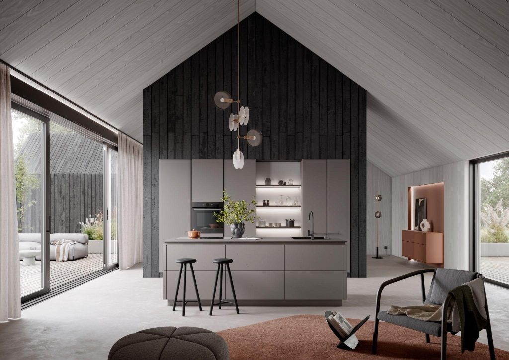
Engineered stone currently dominates new kitchen installations in Australia, largely because it balances durability, consistent colour and manageable pricing better than the alternatives. It’s worth defaulting to unless you specifically want the industrial look of concrete or the professional kitchen feel of stainless steel.
Matte is the most requested finish currently. It absorbs light rather than reflecting it, which suits a contemporary, understated look and hides fingerprints better than gloss. Gloss reflects more light back into the room, which can help a charcoal kitchen feel less heavy in smaller or darker spaces, but it shows marks and fingerprints more readily. Textured finishes (subtle woodgrain effect or matte textured laminates) sit between the two, hiding marks well while adding tactile interest.
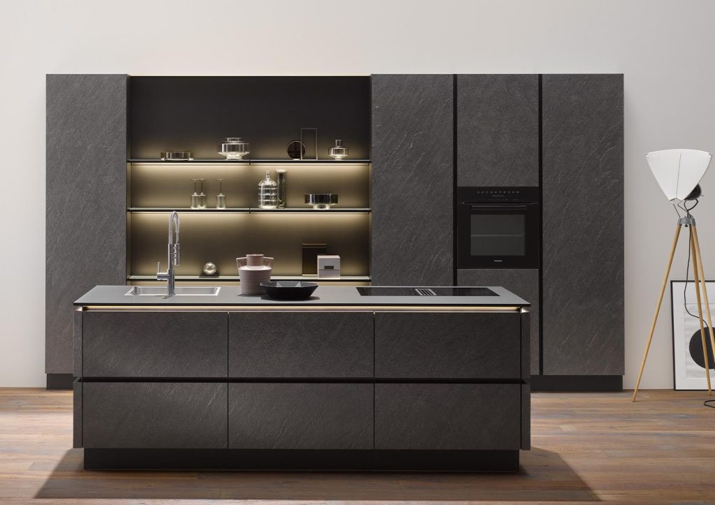
Brushed brass adds warmth and contrast against a cooler grey. Matte black keeps the whole scheme tonal and modern. Brushed nickel is a safer, slightly more traditional option that doesn’t compete with the cabinetry colour.
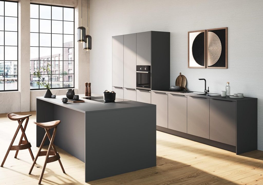
Lean toward more white than charcoal. Charcoal lowers only, white everywhere else, and prioritise natural or warm artificial light. This keeps the ceiling line open and avoids the enclosed feeling an all charcoal scheme can create in a small, low light space.
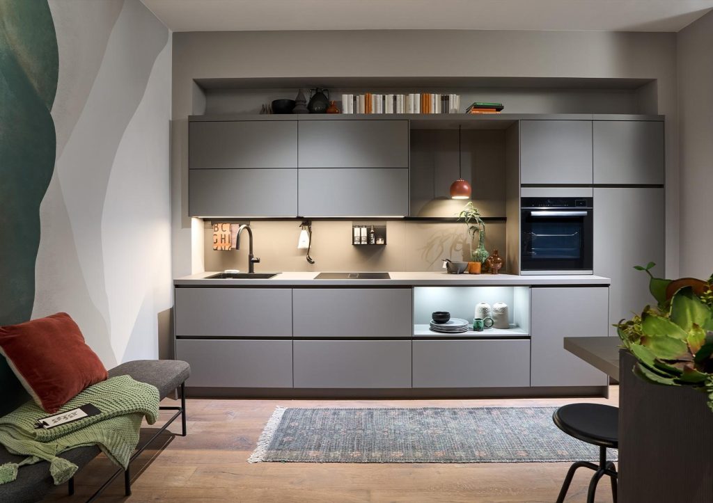
Because it acts more like a neutral than a colour, charcoal works across a wide range of styles:
Not inherently, but an all charcoal scheme in a small, low light kitchen can feel enclosed. The fix is balance: pair charcoal with a lighter benchtop, splashback or upper cabinetry, and prioritise warm lighting over relying on natural light alone.
White, light grey and warm timber tones are the most reliable pairings. Brass and brushed nickel hardware both work well, the choice mostly comes down to whether you want a warmer or cooler overall feel.
Charcoal has held steady as a dark neutral option, alongside black and navy, for several years now, rather than spiking and fading like a true micro trend. Because it functions as a neutral rather than a statement colour, it’s generally considered a safer long term choice than more saturated dark colours.
White or light stone is the most common and lowest risk pairing. If you want a moodier, more monochromatic look, a lighter charcoal or soft grey stone benchtop can work, but keep some contrast between cabinetry and benchtop shade so the two don’t visually merge into one flat surface.

8 emerald green kitchen design ideas, from matte handleless islands to high contrast black pairings. See real designs at Häcker Australia showrooms.
Grey has earned its place as one of the most enduring kitchen colours, and for good reason. Whether you lean towards soft…
A decade ago, a butler’s pantry was considered a luxury reserved for architect-designed homes. Today, it has become one of the most…