
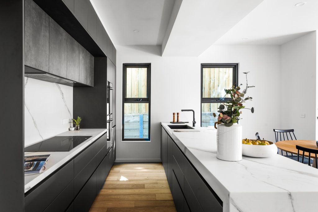
Grey Kitchen Ideas: Timeless Designs for Every Home
Grey has earned its place as one of the most enduring kitchen colours, and for good reason. Whether you lean towards soft…
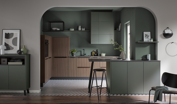
Green has become one of the most popular kitchen colours in Australian homes, and it’s easy to see why. It brings the calm of nature indoors, pairs beautifully with the materials kitchens are built from, and manages to feel both fresh and enduring at the same time. Whether you’re drawn to a soft sage, a warm olive, or a deep forest green, this guide walks you through every shade, style direction, and material pairing worth knowing.
Of all the colours making their way into modern kitchens, green has the broadest appeal. It sits at the intersection of warmth and cool, works across virtually every material kitchens are built from, and adapts across styles from minimal and contemporary to more traditional and character-driven interiors.
Green is also one of the most forgiving choices in terms of longevity. Unlike highly saturated statement colours that can feel tied to a particular moment, green has enough range and natural association that it tends to age gracefully. A well-chosen green kitchen can look just as considered in ten years as it does on day one.
Here is why green earns its place in the kitchen:
The most important decision in a green kitchen is which shade of green. The range is wide, and each sits in a very different design territory. Getting this right before committing to cabinetry is essential.
Sage is currently the most popular green in contemporary Australian homes. It is a muted, grey-green with warm undertones that reads as calm and sophisticated without demanding attention. It pairs naturally with timber, linen, and warm white walls and suits both open-plan and more enclosed kitchen spaces. If you want green without a strong statement, sage is the place to start.
Olive sits warmer and more earthy. It draws from Mediterranean and natural palettes and works particularly well with terracotta tiles, raw stone benchtops, and aged brass hardware. It is a colour with personality, best suited to those who want the kitchen to feel warm and lived-in rather than sleek and minimal.
Forest green moves into deeper, richer territory. It is confident and architectural, with enough depth to anchor a space without the near-black quality of the darkest greens. It works best in kitchens with reasonable natural light and suits handleless cabinetry particularly well, where the uninterrupted surface lets the colour read as one cohesive plane.
Hunter green sits slightly cooler than forest, with blue-grey undertones that give it a more refined, tailored quality. It is one of the most versatile of the deeper greens and works well in both contemporary and more traditional kitchen briefs.
These are the deepest shades, approaching near-black in low light. Used in the right space with good lighting and light-toned surrounding materials, they create an immersive, jewel-box effect that is genuinely striking. They require more careful handling but reward those who commit.
Sitting at the lighter end of the spectrum, mint and light greens tend toward a more playful, retro quality. They suit kitchens with a vintage or eclectic brief but require more careful handling to avoid reading as dated. They work best as an accent rather than the dominant cabinetry colour.
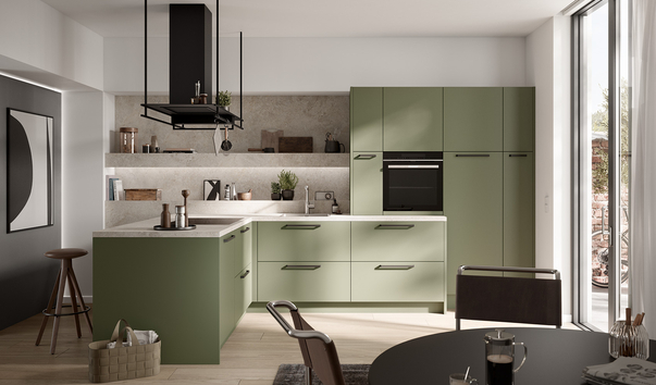
The most popular green combination in Australian homes. Sage green cabinetry with a warm timber benchtop or island, natural stone splashback, and brushed brass hardware creates a palette that is warm, considered, and immediately liveable. It works equally well in a family kitchen or a more formal entertaining space.
Best pairings for this look:
One of the most effective ways to introduce green without fully committing is to use it on lower cabinetry and go neutral on the uppers. White, off-white, or timber upper cabinets keep the room feeling light while the green grounds the lower half. This approach suits kitchens where natural light is limited and works particularly well in galley and L-shaped layouts.
For the most immersive effect, a fully green kitchen with cabinetry, island, and walls in closely related tones creates a cohesive, design-forward result. The key is to vary texture rather than colour:
Textural contrast is what stops a monochromatic palette from feeling flat or oppressive.
A green island against white or warm grey perimeter cabinetry is one of the cleanest expressions of the colour. It introduces green as a deliberate focal point rather than an all-over wash, making it a strong choice for those renovating on a more considered budget or those who want flexibility to evolve the kitchen over time.
Deep green and olive work particularly well in this configuration, especially when paired with a contrasting benchtop material such as marble or dark stone.
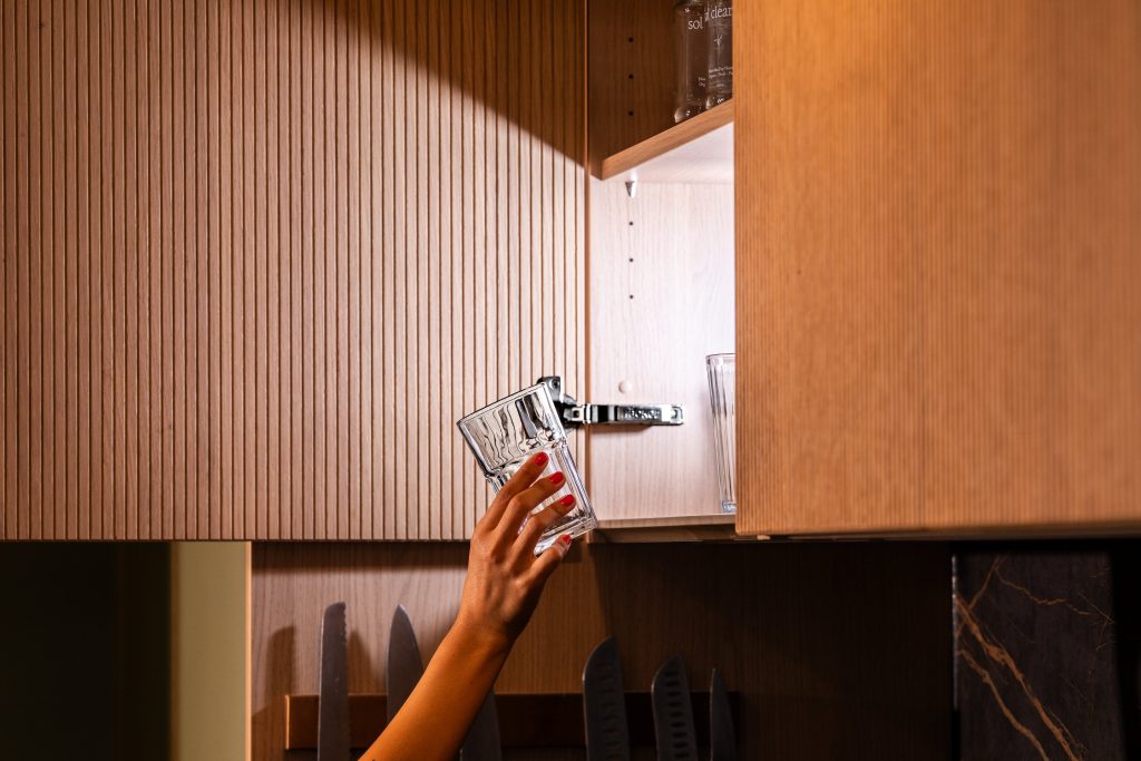
The handleless Hacker, central to German cabinetry engineering, takes on a distinct quality in green. Without hardware interrupting the surface, the colour reads as one continuous architectural plane. In matte lacquer, especially in sage or deep forest green, the result is both bold and restrained. Häcker’s handleless range is engineered with precisely this kind of precision, where tight tolerances and clean lines allow the finish to do all the work.
In open-plan living spaces, green cabinetry plays a different role. It needs to hold its own against the surrounding living and dining areas without dominating the entire floor plate. Some approaches that work well:
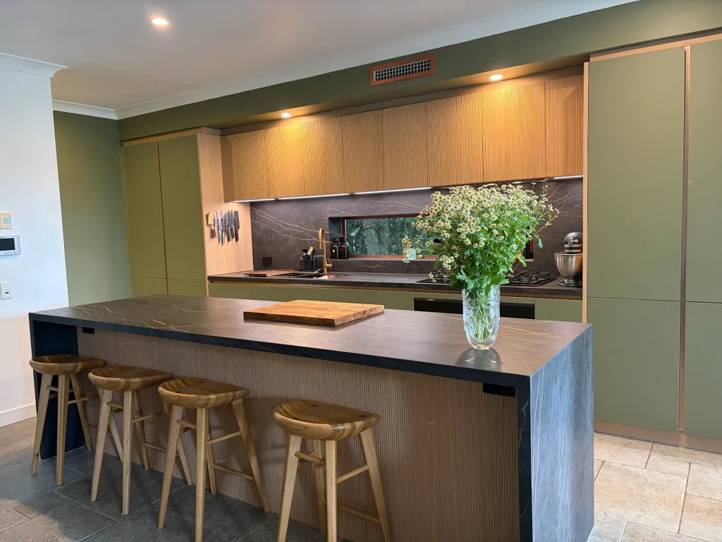
Getting the material pairings right is what separates a good green kitchen from a great one.
Hardware
Benchtops
Splashbacks
Flooring
Lighting is where green kitchens succeed or fail. Darker shades absorb light and can make a space feel smaller if not compensated for.
Natural light is the most important factor. Assess your kitchen’s orientation before committing to a deep shade. South-facing kitchens with limited sun should lean toward lighter greens or compensate with excellent artificial lighting.
Under-cabinet lighting is non-negotiable in any green kitchen. It warms the benchtop, separates surfaces visually, and ensures the cabinetry reads as intentional rather than dim.
Pendant lighting over an island anchors the space and adds a design layer. For green kitchens:
Bulb temperature matters more than most people realise. Warm bulbs (2700-3000K) work best with green. Cool white light strips warmth from the tone and makes even a well-chosen green look flat and uninviting.
Even a well-chosen green can go wrong in execution. Here are the most common mistakes:

Grey has earned its place as one of the most enduring kitchen colours, and for good reason. Whether you lean towards soft…
A decade ago, a butler’s pantry was considered a luxury reserved for architect-designed homes. Today, it has become one of the most…
For years, white and grey dominated kitchen design. Now, a warmer, richer alternative has taken hold: the walnut kitchen. With its deep…