
Grey Kitchen Ideas: Timeless Designs for Every Home
Grey has earned its place as one of the most enduring kitchen colours, and for good reason. Whether you lean towards soft…
Blue is one of the most versatile and enduring colours you can bring into a kitchen. From soft powder blues that feel light and airy to deep navy that anchors a space with quiet authority, blue covers a remarkably wide design range. It works in contemporary and classic kitchens alike, pairs with almost every material, and unlike some of the more trend-driven colour choices, it has a long history of looking just as good years down the track.
If you are considering blue for your kitchen renovation, this guide covers everything you need to know: which shade suits your space, how to pair it, what to avoid, and how to bring the whole look together.
Blue has an innate quality that makes it particularly well-suited to the kitchen environment. It is calm and grounding without being cold, and it brings a sense of considered intention to a space that is often the hardest-working room in the home.
Here is why blue earns its place as a kitchen colour:
Choosing the right shade of blue is the most important decision in a blue kitchen. The range is wide and each shade creates an entirely different atmosphere.
The softest end of the spectrum. Powder blue reads as gentle, light-filled, and almost nostalgic. It suits kitchens with a coastal, Hamptons, or vintage-inspired brief and works best in spaces with good natural light. It pairs naturally with white cabinetry, timber benchtops, and wicker or rattan accents.
A muted, green-tinged blue that sits firmly in the realm of the considered and classic. Duck egg is one of the most popular blue shades for kitchen cabinetry because it feels both distinctive and timeless. It suits shaker-style and more traditional cabinetry but can also work beautifully in a contemporary handleless design where the subtlety of the tone is given room to breathe.
Warmer and brighter, French blue has a Mediterranean quality that makes kitchens feel sunny and inviting. It works particularly well in open-plan spaces where the kitchen needs to hold its own visually. Cornflower blue is slightly cooler and more saturated, lending itself to a more graphic, contemporary palette.
These mid-toned, grey-inflected blues are the most versatile of the range. They are sophisticated without being bold, and they sit comfortably in both minimalist and more layered interiors. Steel and slate blue cabinetry pairs exceptionally well with warm stone benchtops and brushed metal hardware.
Deep, rich, and authoritative. Navy in particular has become one of the most requested kitchen colours in premium renovations. It creates a dramatic contrast against white walls or light stone benchtops, and in a handleless design, the uninterrupted depth of the colour reads as genuinely architectural. Indigo introduces a slight purple undertone that softens the drama slightly and works well in spaces with warm artificial lighting.
The deepest of the blues, approaching near-black in low light. These shades require generous lighting and careful material balance to reveal their full depth, but when executed well, they create an immersive, jewel-box effect. Best suited to kitchens with strong natural light or excellent artificial lighting design.
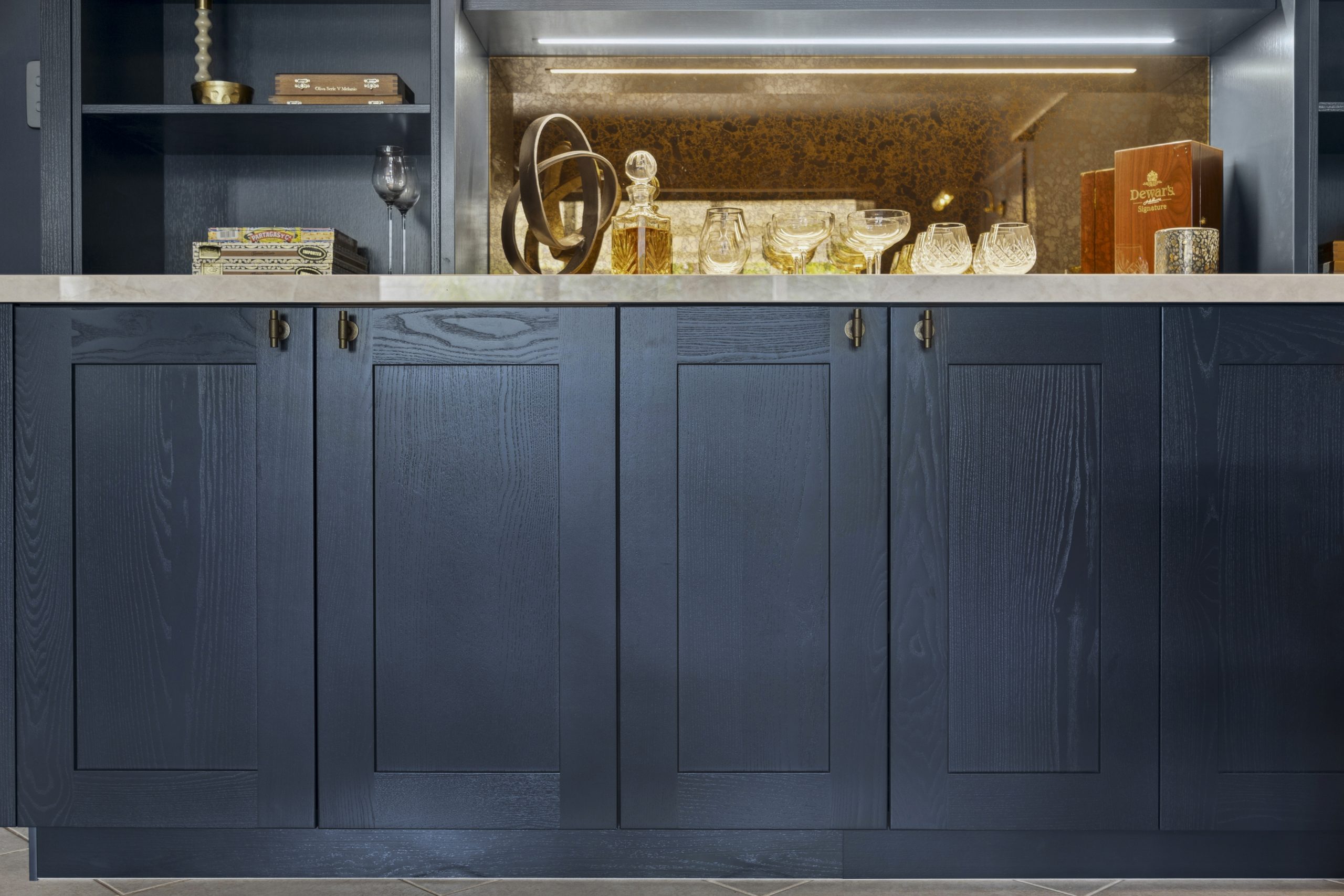
One of the most classic combinations in contemporary kitchen design. Deep navy cabinetry, brushed or polished brass tapware and handles, and a white or light stone benchtop create a palette that is rich and timeless. The warmth of the brass counterbalances the coolness of the navy, and the result is a kitchen that feels considered and luxurious without being overdone.
Best pairings for this look:
A two-tone kitchen with soft blue lower cabinetry and white or off-white upper cabinetry is one of the most approachable and practical blue kitchen configurations. It keeps the room feeling light and open while introducing colour in a grounded, considered way. This approach works particularly well in kitchens with limited natural light, where a full-depth blue might feel oppressive.
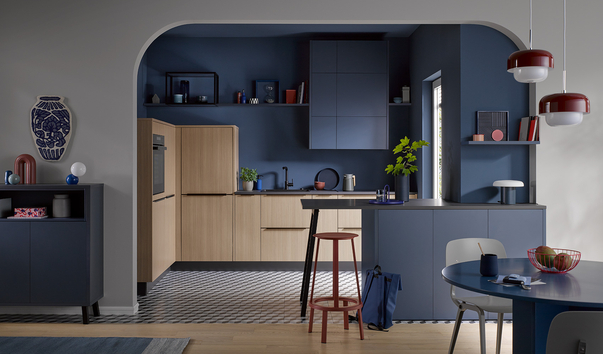
For those willing to commit, a fully blue kitchen with cabinetry, island, and walls in closely related tones creates a cohesive, immersive result. The key is managing texture to avoid the space feeling flat:
A blue island against white or light grey perimeter cabinetry is one of the most popular and versatile expressions of the colour in contemporary Australian kitchens. It introduces blue as an intentional focal point rather than an all-over commitment, which gives the space flexibility and longevity. Navy, steel blue, and French blue all work well in this configuration.
The handleless kitchen, a defining feature of German cabinetry design, takes on a particularly strong character in blue. Without hardware breaking the surface, the colour reads as a continuous architectural element. In deep navy or midnight blue matte lacquer, the result is striking and modern. In softer shades like duck egg or slate blue, the effect is more refined and understated.
Häcker’s handleless designs are engineered to the tolerances that make this possible, where the precision of the door gap and the consistency of the finish work together to create surfaces that look as good at close range as they do from across the room.
Hardware
Benchtops
Splashbacks
Flooring
Blue is one of the most adaptable kitchen colours when it comes to the broader palette. Here are the combinations that consistently deliver:
Lighting requires careful thought in a blue kitchen. Blue is a colour that shifts significantly under different light conditions, and without good lighting design, even a well-chosen shade can miss the mark.
Natural light is the most critical factor. Assess your kitchen’s orientation before settling on a shade. South-facing kitchens with limited direct sun are better suited to warmer blues (duck egg, French blue) or mid-tones (steel blue) than the deepest shades.
Under-cabinet lighting is essential. It illuminates the benchtop, warms the lower half of the kitchen, and ensures the cabinetry reads as intentional rather than simply dark.
Pendant lighting over the island is both functional and decorative. For blue kitchens:

Grey has earned its place as one of the most enduring kitchen colours, and for good reason. Whether you lean towards soft…
A decade ago, a butler’s pantry was considered a luxury reserved for architect-designed homes. Today, it has become one of the most…
For years, white and grey dominated kitchen design. Now, a warmer, richer alternative has taken hold: the walnut kitchen. With its deep…