
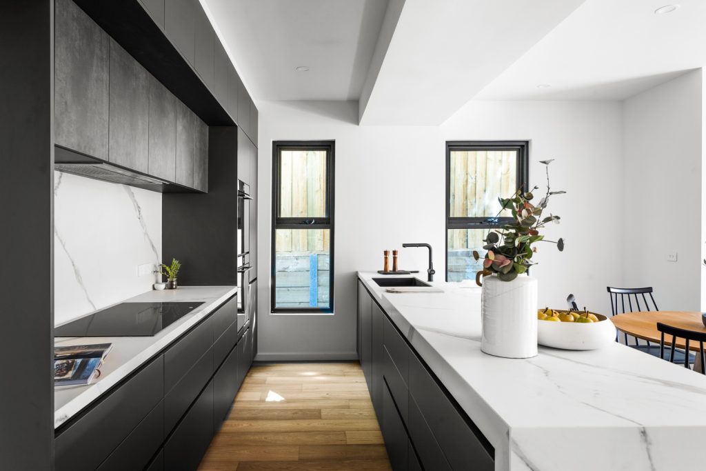
Grey Kitchen Ideas: Timeless Designs for Every Home
Grey has earned its place as one of the most enduring kitchen colours, and for good reason. Whether you lean towards soft…
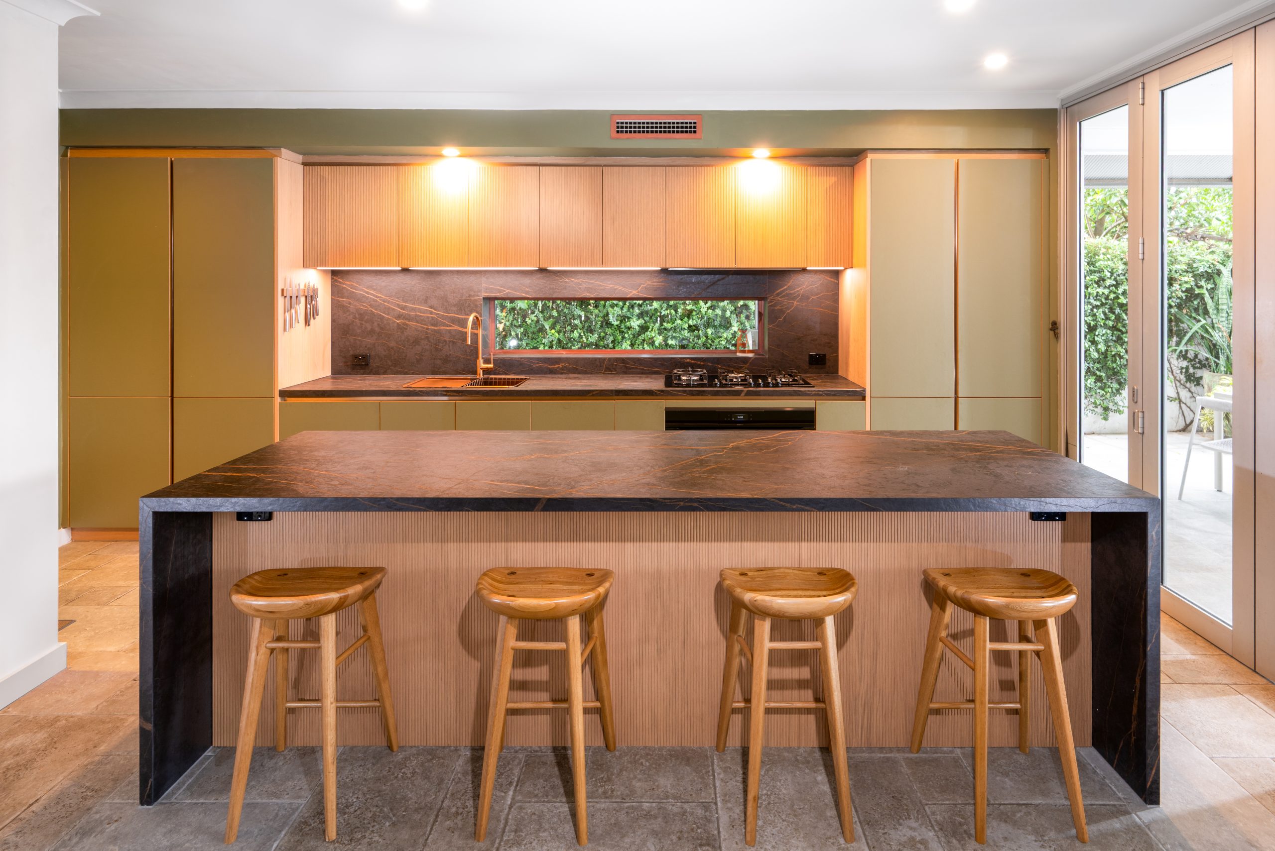
Renovating a kitchen is one of the biggest design decisions a homeowner will make, and colour is where most people start, and where most people get stuck. For high-end renovators and new-home builders, neutral kitchen colours remain the safest way to invest in a space that feels luxurious today and still looks considered in a decade.
That’s not an accident. Neutral palettes have been the foundation of Häcker’s design philosophy for over 125 years of German craftsmanship. Rather than chasing trend cycles, our approach pairs enduring neutral tones with minimalist cabinetry, handleless styles, and precision engineering, so the colour scheme supports the architecture instead of competing with it.
This guide breaks down what counts as a neutral kitchen colour, the most popular schemes for 2026, and how to apply neutrals across cabinetry, paint, and backsplash so your kitchen, and the rest of your home, feels cohesive for years to come.
At its simplest, a neutral colour is one that reads as a “background” tone rather than a dominant statement colour. In kitchen design, this typically includes:
A useful way to picture the spectrum: on one end you have cool, crisp whites and greys; on the other, warm stone, taupe, and clay. Most well-designed neutral kitchens sit somewhere in the middle, using one dominant neutral with a second, complementary shade for contrast.
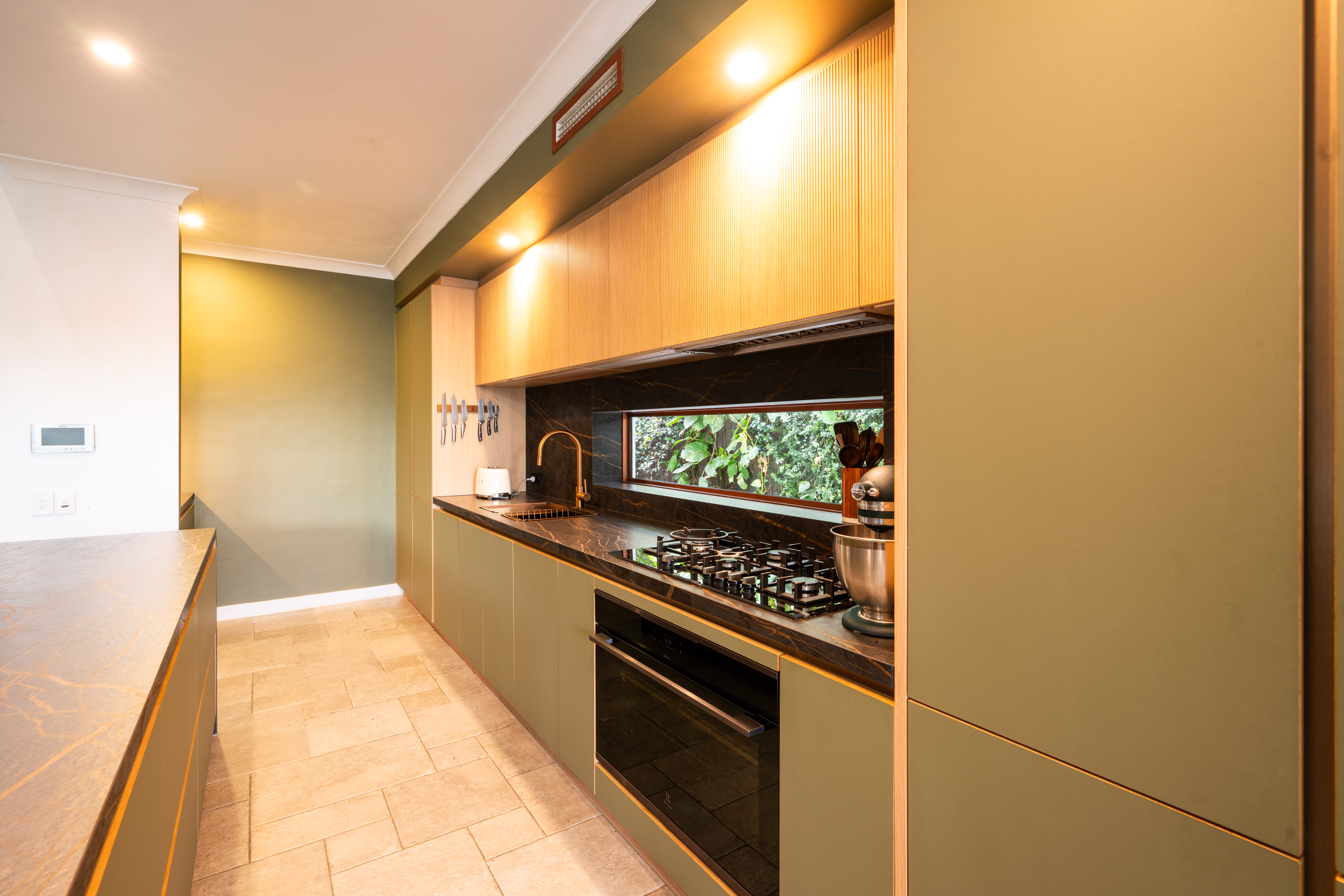
Neutral doesn’t mean flat. The most successful neutral kitchen colour schemes use tonal layering, pairing two or three related shades with different finishes and textures, rather than a single flat colour across every surface.
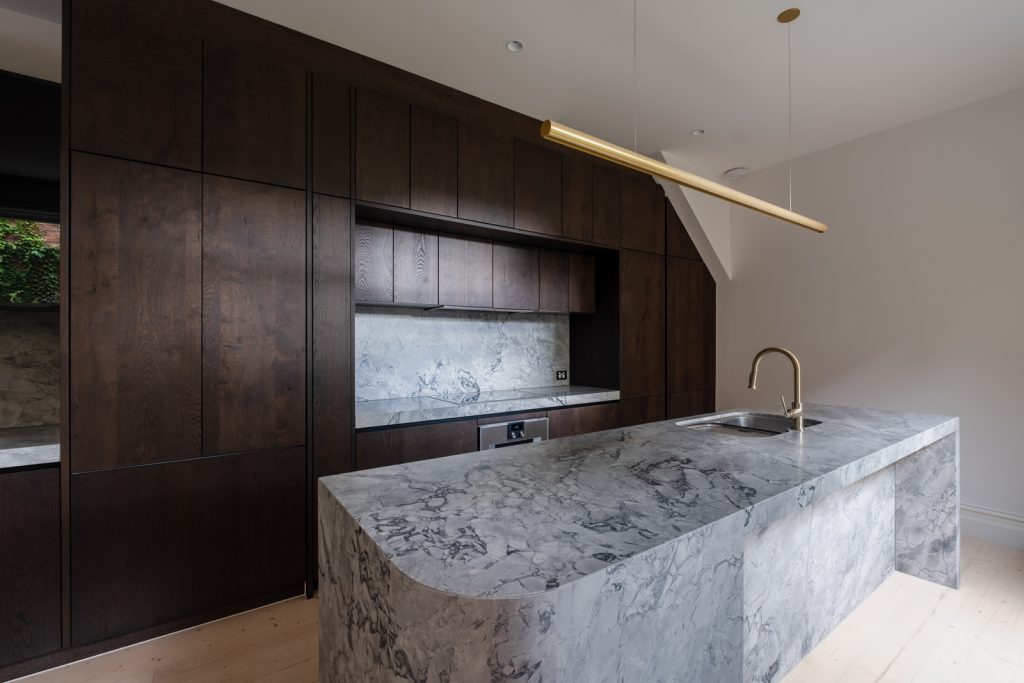
Warm neutrals, think stone, greige, and soft clay, have overtaken cool white as the dominant direction in Australian kitchen design for 2026. They pair beautifully with timber, brushed brass, and natural stone benchtops, and they tend to hide everyday marks better than a stark white. In a Häcker kitchen, a warm stone-toned cabinet front works particularly well against the clean geometry of the Flying Bridge, which relies on light and shadow to create its signature floating effect. A warmer neutral base actually enhances that visual depth rather than flattening it.
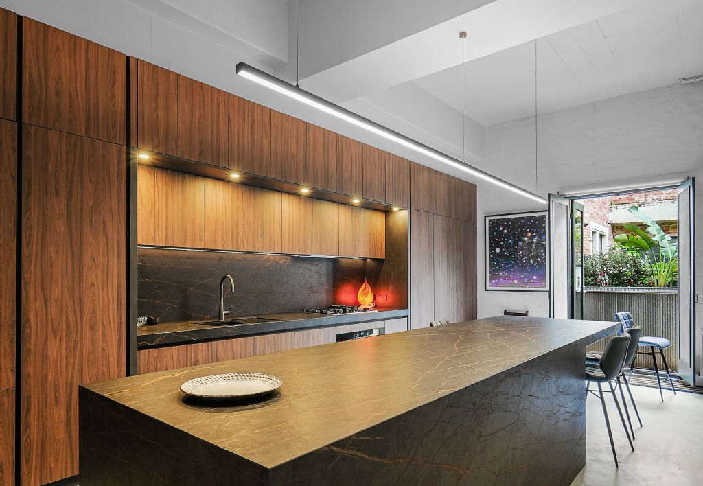
Cool greys and whites remain a strong choice for a sleek, contemporary look, especially in kitchens with plenty of natural light or where stainless steel and glass are already part of the material palette. Cool neutrals suit minimalist, handleless designs particularly well, since the flatness of the colour lets the clean lines of the cabinetry do the talking.
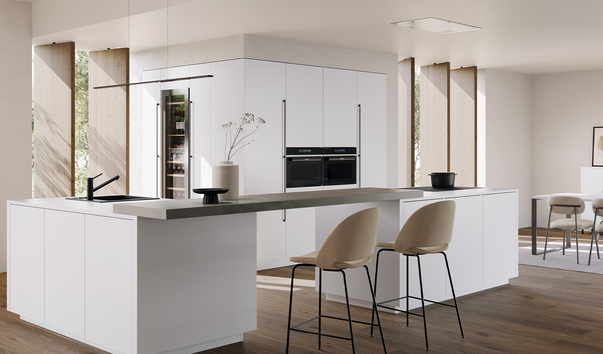
Pairing a lighter and darker neutral, for example, a warm stone lower cabinet with a soft white or taupe upper, is one of the most popular ways to add depth without introducing bold colour. This is also where the Flying Bridge feature earns its keep as a design focal point: a two-tone neutral scheme draws the eye naturally toward the “floating” bridge element, turning what could be a purely functional storage solution into the visual centrepiece of the room.
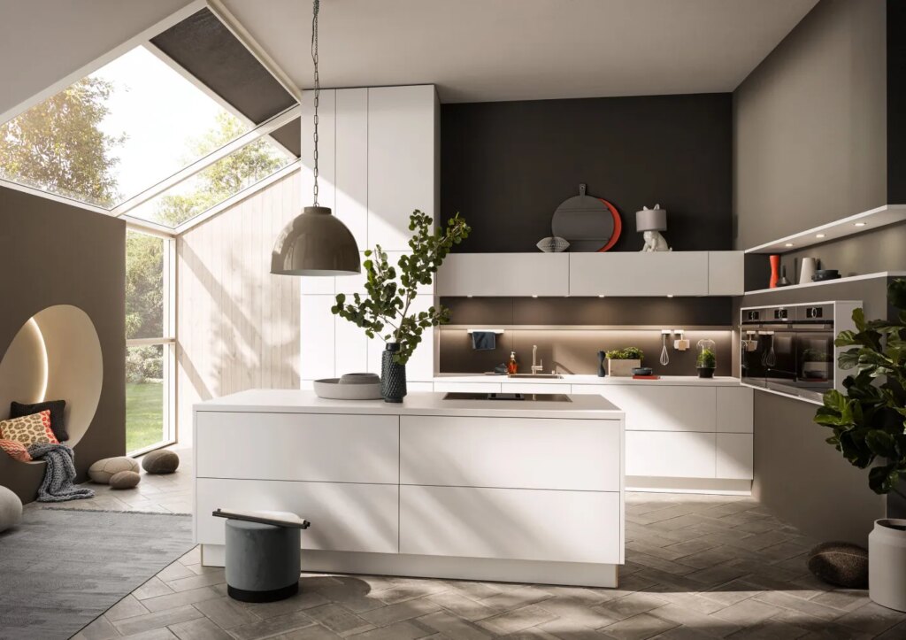
Colour is only half the story. The material and finish of your cabinetry determines how a neutral tone actually reads in your space. Häcker’s handleless cabinet styles are engineered in Germany with a level of precision that keeps sightlines clean and joints virtually invisible, which matters more with neutral colours than bold ones, since imperfections are far more visible against a flat, pale surface.
Matte finishes are currently the preferred direction for neutral cabinetry in Australia, as they diffuse natural light softly rather than reflecting it harshly, ideal given how strong Australian daylight can be. Durability matters too: neutral cabinetry, particularly in lighter tones, needs a finish that resists fading and marking over time, which is where German-engineered manufacturing has a genuine advantage over mass-produced alternatives.
Because Häcker’s philosophy extends to whole-home joinery, the same neutral palette used in your kitchen can carry through to your hallway, laundry, bathroom, and study, creating a consistent, considered look throughout the home rather than a kitchen that feels visually disconnected from everything around it.
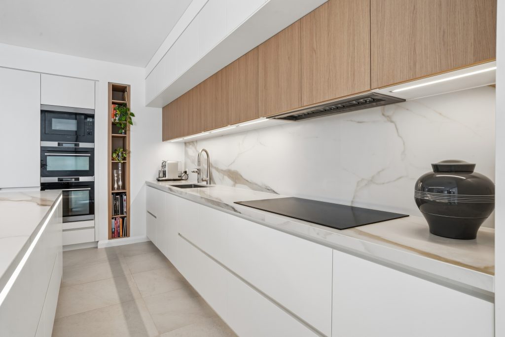
A neutral backsplash is often where subtle texture does the heavy lifting. Some of the most effective pairings include:
The goal with a neutral backsplash isn’t to introduce a new colour, but to introduce a new texture within the same tonal family.
Because Australia’s natural light is so strong and directional, the same neutral paint swatch can look completely different depending on your kitchen’s orientation and the time of day.
A few practical guidelines:
Kitchen colour preferences shift subtly by city and climate, and the showroom experience reflects that:
Wherever you’re renovating, visiting a showroom in person remains the most reliable way to judge how a neutral tone will actually perform in your home’s light.
Neutral colour schemes are only as good as the cabinetry behind them, and this is where Häcker’s German engineering sets a different standard. Every neutral finish is applied with the same precision that earned Häcker Australia the “Best Kitchen of the Year” award in February 2026, recognition that reflects both design quality and manufacturing standards, not just aesthetics.
Combined with the patented Flying Bridge feature, which uses light, shadow, and clean geometry to create a “floating” visual effect, a neutral Häcker kitchen doesn’t just avoid dating badly. It actively showcases the craftsmanship behind it in a way a flatter, mass-produced kitchen simply can’t.

Grey has earned its place as one of the most enduring kitchen colours, and for good reason. Whether you lean towards soft…
A decade ago, a butler’s pantry was considered a luxury reserved for architect-designed homes. Today, it has become one of the most…
For years, white and grey dominated kitchen design. Now, a warmer, richer alternative has taken hold: the walnut kitchen. With its deep…